S.

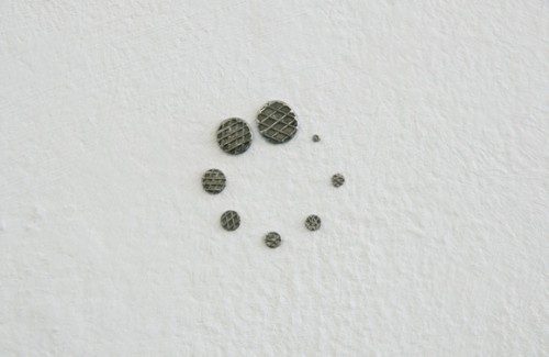
Staring at the Wall

YouTube

Youtube (Staring at the Wall) by Helmut Smits

Year: 2010
Materials: nails in different sizes, wall
Dimensions: 3 x 3 cm

Apple
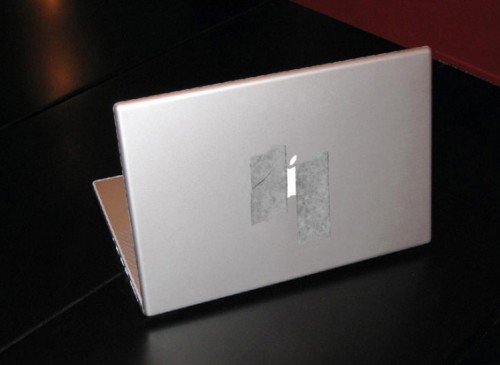
Candlelight by Helmut Smits

Year: unknown
Materials: Tape, MacBook Pro
Dimensions: 15″

Google Earth
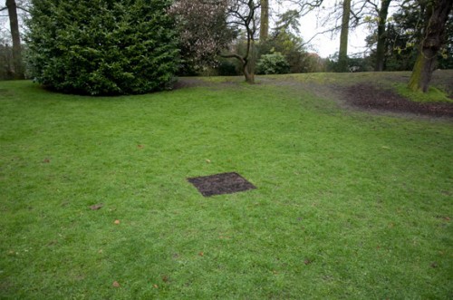
Dead Pixel in Google Earth by Helmut Smits

Year: 2008-2010
Materials: burned square, grassland
Dimensions: 82 x 82 cm

Make sure you check out all the inspiring ideas by Helmut Smits at his web site or in his book “123 Ideas by Helmut Smits”:
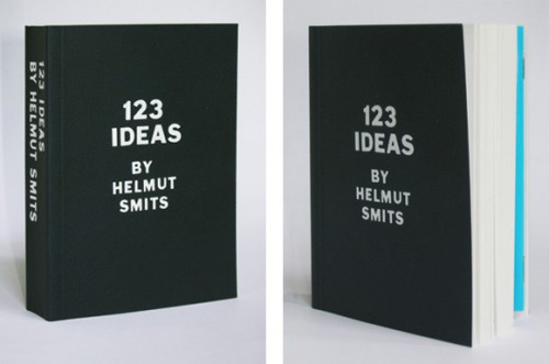
123 Ideas by Helmut Smits

And if you are lucky one of them flies by…

Title: Pamphlet
Year: 2006
Materials: computer, software, printer
People could type a message on the laptop. By pressing ‘send’ a pamphlet was printed and dropped from the 10th floor.

S.

Storytelling Three Ways

1 Storybird

Collaborative storytelling; short, art-inspired stories you make to share, read, and print. Create your own story at www.storybird.com!

2 Smories

A continuous flow of new stories, read aloud by kids. Listen to and submit “smories” at www.smories.com

3 36pages

36 isn’t very many pages—unless you make picture books. Get inspired by Craig Frazier’s reviews at www.36pages.com

P.

Paris vs NYC

A visual but friendly match between those two cities seen by a lover of Paris wandering through New York’s infinite details, clichés and contradictions.

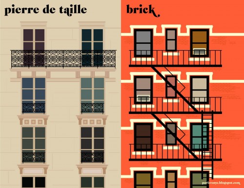
Paris vs NYC - Pierre de taille vs Brick
(c) Vahram Muratyan - parisvsnyc.blogspot.com

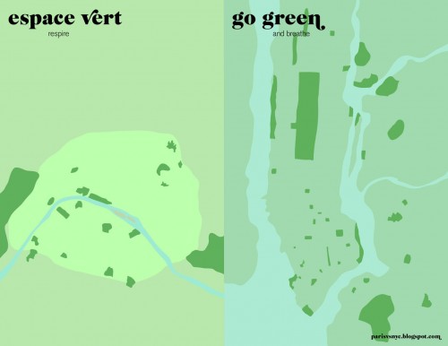
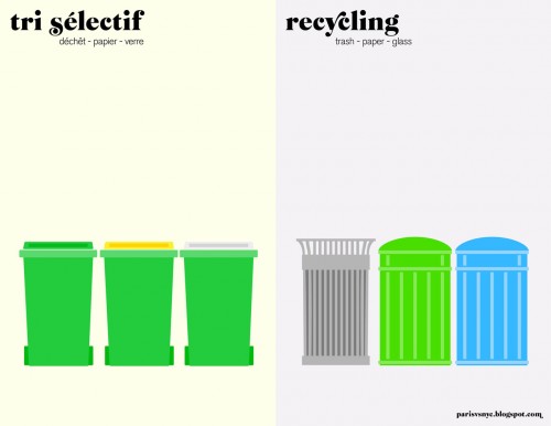
Vahram Muratyan, a curious mind and talented designer, reduced the differences between Big Apple and the City of Light to the essential. As a result he shows us great visualizations of urban lifestyle on both sides of the Atlantic. I appreciate his minimalist approach amongst all those overloaded infographics of our days.

It would be interesting to see other cities matched, too. Berlin could be especially funny, with “Mietskaserne”, “Kaffee Latte”, “Trinkgeld”, “Grünanlagen”, “Mülltrennung” etc.

For many more matches between the two cities have a look at parisvsnyc.blogspot.com and follow @parisvsnyc on Twitter!

Paris vs NYC - Espresso vs Americano
(c) Vahram Muratyan - parisvsnyc.blogspot.com
Paris vs NYC - Pourboire vs Tip
(c) Vahram Muratyan - parisvsnyc.blogspot.com
Paris vs NYC - Espace vert vs Go green
(c) Vahram Muratyan - parisvsnyc.blogspot.com
Paris vs NYC - Tri sélectif vs Recycling
(c) Vahram Muratyan - parisvsnyc.blogspot.com
G.

Glitch Art – The Beauty of Imperfection

“Imperfection is beauty, madness is genius and it’s better to be absolutely ridiculous than absolutely boring.” (Marilyn Monroe)

In a technical sense a glitch is the unexpected result of a malfunction. The term is thought to derive from the German glitschig, meaning ‘slippery.’ Glitches are mostly a result of miscommunication or mistranslation when transferring data in software, video games, images, video and audio. The term glitch came to be associated with music and visual arts in the mid 1990s to describe a general aesthetic of the digital age.

Iman Moradi, the first official glitch theorist, has written extensively on the subject of glitch art beginning with his dissertation for the University of Huddersfield (PDF) until the publication of his recently released book Glitch: Designing Imperfections.

Moradi divides glitch art in two categories: The first is the pure glitch which is the result of a malfunction or error, an unpremeditated digital artifact. The second is the glitch-alike which is the result of an intentional decision on the user side.

All those who didn’t see the beauty in category one glitches yet should definitely consider reading this eye-opening book to brighten up their life: losing all the data on your hard drive eventually becomes art next time.

All category two artists trying to create there first own glitches should open WordPad on a Windows PC and follow stAllio’s short introduction.

Related post: IOgraph – Everyone is an artist

7.

7 days, 7 levels, 8 Bit – An Animated History of Creation

SUPERNATURAL CREATOR 2 on Vimeo.

This simple, minimalistic and therefore even more impressive animation was created by Mareike Ottrand during a workshop with only 3 days for conception and realisation at the F2F International conference.

The animation is based on the “ex nihilo” version of the creation myth, known from Genesis I in the Bible in Judaism and Christianity, and from the Koran’s Sura VII in Islam. The funny and creative idea was to match the seven days of the creation week with seven levels of a video game called “Supernatural Creator 2”:

  • 1st day / Level 1: “Let there be light!” The light is divided from the darkness, and “day” and “night” are named.
  • 2nd day / Level 2: “Let a firmament be…!” God creates a firmament to divide the waters above from the waters below. The firmament is named “skies”.
  • 3rd day / Level 3: God commands the waters below to be gathered together in one place, and dry land to appear. God commands the earth to bring forth grass, plants, and fruit-bearing trees (the fourth command).
  • 4th day / Level 4: God creates lights in the firmament to separate light from darkness and to mark days, seasons and years. Two great lights are made, and the stars.
  • 5th day / Level 5: God commands the sea to “teem with living creatures”, and birds to fly across the heavens. He creates birds and sea creatures, and commands them to be fruitful and multiply.
  • 6th day / Level 6: God commands the land to bring forth living creatures. He makes wild beasts, livestock and reptiles. He then creates humanity in His “image” and “likeness”. They are told to “be fruitful, and multiply, and fill the earth, and subdue it.” The totality of creation is described by God as “very good.”
  • 7th day / Level 7: God, having completed the heavens and the earth, rests from His work, and blesses and sanctifies the seventh day.

A particularily strong moment arrives, when the creator is asked the common video game question “Try again?” and chooses: “No!” before taking a rest in Level 7.

Nice idea, minimalitic graphics and sounds, great work!