P.

Paris vs NYC

A visual but friendly match between those two cities seen by a lover of Paris wandering through New York’s infinite details, clichés and contradictions.
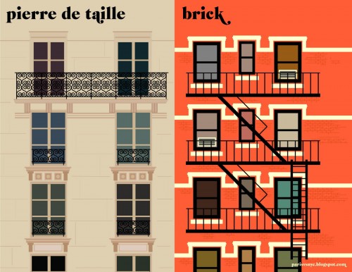
Paris vs NYC - Pierre de taille vs Brick
(c) Vahram Muratyan - parisvsnyc.blogspot.com

Vahram Muratyan, a curious mind and talented designer, reduced the differences between Big Apple and the City of Light to the essential. As a result he shows us great visualizations of urban lifestyle on both sides of the Atlantic. I appreciate his minimalist approach amongst all those overloaded infographics of our days.

It would be interesting to see other cities matched, too. Berlin could be especially funny, with “Mietskaserne”, “Kaffee Latte”, “Trinkgeld”, “Grünanlagen”, “Mülltrennung” etc.

For many more matches between the two cities have a look at parisvsnyc.blogspot.com and follow @parisvsnyc on Twitter!

Paris vs NYC - Espresso vs Americano
(c) Vahram Muratyan - parisvsnyc.blogspot.com
Paris vs NYC - Pourboire vs Tip
(c) Vahram Muratyan - parisvsnyc.blogspot.com
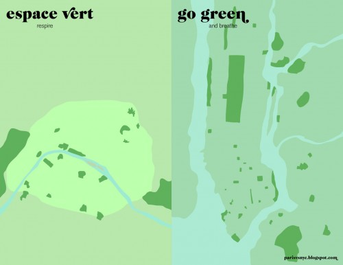
Paris vs NYC - Espace vert vs Go green
(c) Vahram Muratyan - parisvsnyc.blogspot.com
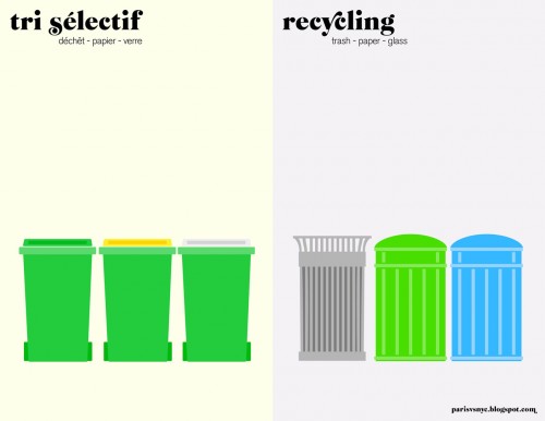
Paris vs NYC - Tri sélectif vs Recycling
(c) Vahram Muratyan - parisvsnyc.blogspot.com
C.

Crossing the Universe on a Logarithmic Scale

Powers of Ten by Charles and Ray Eames.

“Powers of Ten”, a 1968 short film by Charles and Ray Eames, is a quite impressive application of the logarithmic scale. The film is an adaptation of “Cosmic View”, a 1957 book by Kees Boeke. Both the book and the film deal with very short and very long distances and the relative size of things in the universe. Although Einstein wouldn’t agree with the trip, because very soon the camera travels faster than the speed of light, you should have a look at what it means to cross the universe on a logarithmic scale. Every ten seconds you will add a zero to your distance and stride away from earth by the factor ten: from meters, to 10 meters, 100 meters, 1000 meters and so on. Some minutes later and lightyears away you pass the nearest star. The way back is even faster and leads you through the skin and the DNA to the subatomic scale. Impressive! Enjoy the trip!

Cosmic View by Kees Boeke

www.eamesoffice.com

S.

Street View for the Milky Way

Humanity has gone a long way from the first scientific map of the universe created by Copernicus in 1543. Nowadays we have not only expanded our knowledge about ‘the starry sky above us’ but also improved our technologies to represent and visualize large amounts of data.

For the last 12 years, Carter Emmart, Director of Astrovisualization at American Museum of Natural History, has been coordinating efforts of scientists, artists and programmers to build a complete 3D visualization of the universe. In a recent TED talk he explained the latest results of his efforts and – at least a bit – the universe.

‘The Known Universe’ visualizes data from the Digital Universe Atlas, the most complete (and downloadable) 3D atlas of the universe. Ben R. Oppenheimer likens the atlas to Mercator’s invention of the globe: “It gave everyone a new perspective on where they live in relation to others, and we hope that the Digital Universe does the same on a grander, cosmic scale.” But do we really get beyond the horizon and understand our planet as a limited condition? There is still a long way to go, but better visualization may help.

Carter Emmart’s film was also part of a recent exhibition at the Rubin Museum of Art.

M.

Making Music at the Speed of Light

Everything that vibrates makes music. The music that is perceived by human beings is human music. For being able to perceive the music of atoms, stars, and animals, it has to be transformed. (Karlheinz Stockhausen 1975)

Sonification is the use of sounds to perceptualize data and information. It is an interesting complement or even an alternative to visualization techniques. Infographics have already become widespread and are considered as cool or even sexy.

Just imagine the huge potential of infosounds in the future.

“ATLAS is a music box” (c) Toya Walker.

One impressing example of sonification is the Large Hadron Collider (LHC) at CERN in Switzerland. LHC was in the news recently when it broke its own energy world record on March 30, 2010. The high energy collision created an enormous quantity of data which inot only  a big challenge in the field of computing, but also may be one of the reasons why LHC made it’s way into the world of music and sounds.

Here is a visualization of what happened inside the LHC when two opposing particle beams collided with an energy of 7 000 000 000 000 eV:

httpv://www.youtube.com/watch?v=EP0ouOgMuNY

Now a group of particle physicists, composers, software developers and artists in the UK started a project called LHCsound, turning real and simulated data from the ATLAS detector at the Large Hadron Collider into sounds.

The team members Lily Asquith, a particle physicist, Richard Dobson, a composer and music software developer, Archer Endrich, a composer, Toya Walker, an illustrator and painter, Ed Chocolate, a London-based producer and DJ and Sir Eddie Real, a percussionist, want to attract people to the results of the LHC experiments in a way that is novel, exciting and accessible.

Their “simplest” example of sonification is HiggsJetSimple. This sonification transforms properties of the particle jet to properties of sound: energy becomes volume, distance defines timing and the deflection of the beam is the pitch. In this example the sounds reduce in density very much towards the end, with isolated events separated by silences of several seconds:

httpv://www.youtube.com/watch?v=IrXqptn6qvo

By the way, Frank Zappa sonified the search for Higgs’ boson many years ago. You can find it on his album Trance-Fusion.
httpv://www.youtube.com/watch?v=2lHixowXnlU

In principle any data can be sonified. NASA sonified the sun and the planets. Seismic data of earthquakes and volcanos has been sonified to great use. You can even sonify a painting, photograph or moving image which has enabled blind people to see with sound.

Sonification has a great potential and I am eager to see if it can make its way into popular culture like data visualization did with infographics.

(Thank you Toya Walker, CERN, Frank Zappa and LHCsound)

E.

Everyone is an artist

Joseph Beuys’ famous slogan “Everyone is an artist” showed his belief in the central role of creativity in everyone’s lives. We should not see creativity as the special realm of artists, but everyone can apply creative thinking in his or her own area.

Now a team of Russian designers made it easier to see the art in your everyday computer activities. Their free little Java application MousePath, which was renamed recently and is now known as IOGraph, captures your mouse movements and draws them on a blank canvas. Have you ever wondered what your mouse is doing when it’s moving around imperceptibly? Now you can see it!

Mousetrap

The developers Anatoly Zenkov and Andrey Shipilov say: “IOGraph is intended to brighten up your dull work, computer related routine and, hell yeah, it makes you an artist.” Run IOGraph, then forget about IOGraph and do your business as usual. When you come back after some minutes or several hours you will see what you have done. The lines in the picture are movements, the dots occur where the mouse is stopped. With IOGraph you will see your computer work from a different  perspective. Try it out!

Download IOGraph for free (Windows, Linux and Mac OSX) at www.iographica.com