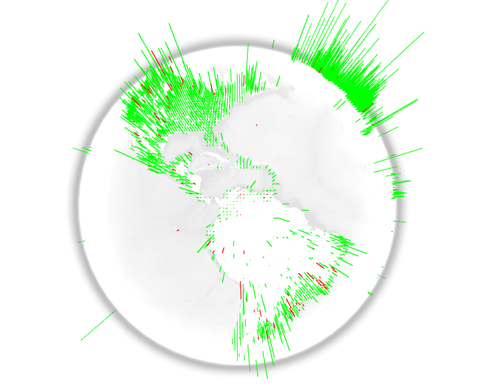
The WebGL Globe is an open platform for geographic data visualization. It was created by the Google Data Arts Team and is still in early development. Users are encouraged to copy the code, add their own data, and create their own globes. The user generated visualizations can then be featured on the project’s website. The WebGL Globe is able to display a JSON file. It requires latitude, longitude and the magnitude related with the location. It would certainly be interesting to visualize education related data with open data from the Worldbank, OECD and others.
The History Of The Two-Party Presidential Vote Mapped
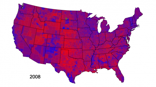
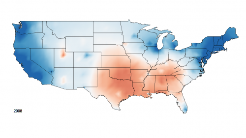
Cloropleths vs Isarithmic: Voting within or without boundaries
There have been two major ways to understand populations and their territorial distribution. In one kind, typified by choropleth maps, the density or degree of a feature is mapped in pre-given political units.*

As second kind of map, known as isarithmic mapping (…), shows change varying continiously over space.*

Where chloropleths maps produce a sense of populations as contained within boundaries, isarithmic mapping emphasizes continual variation and gradual change without clear differentiations.*
References
- The Book: * Jeremy W. Crampton: Mapping: a critical introduction to cartography and GIS, Wiley and Blackwell, 2010, p. 149
- The Blog: More details about the process and the data behind these maps is available on David B. Sparks’ blog.
- The Video: Isarithmic History of the Two-Party Presidential Vote
Crossing the Universe on a Logarithmic Scale
Powers of Ten by Charles and Ray Eames.
“Powers of Ten”, a 1968 short film by Charles and Ray Eames, is a quite impressive application of the logarithmic scale. The film is an adaptation of “Cosmic View”, a 1957 book by Kees Boeke. Both the book and the film deal with very short and very long distances and the relative size of things in the universe. Although Einstein wouldn’t agree with the trip, because very soon the camera travels faster than the speed of light, you should have a look at what it means to cross the universe on a logarithmic scale. Every ten seconds you will add a zero to your distance and stride away from earth by the factor ten: from meters, to 10 meters, 100 meters, 1000 meters and so on. Some minutes later and lightyears away you pass the nearest star. The way back is even faster and leads you through the skin and the DNA to the subatomic scale. Impressive! Enjoy the trip!
Street View for the Milky Way

Humanity has gone a long way from the first scientific map of the universe created by Copernicus in 1543. Nowadays we have not only expanded our knowledge about ‘the starry sky above us’ but also improved our technologies to represent and visualize large amounts of data.
For the last 12 years, Carter Emmart, Director of Astrovisualization at American Museum of Natural History, has been coordinating efforts of scientists, artists and programmers to build a complete 3D visualization of the universe. In a recent TED talk he explained the latest results of his efforts and – at least a bit – the universe.
‘The Known Universe’ visualizes data from the Digital Universe Atlas, the most complete (and downloadable) 3D atlas of the universe. Ben R. Oppenheimer likens the atlas to Mercator’s invention of the globe: “It gave everyone a new perspective on where they live in relation to others, and we hope that the Digital Universe does the same on a grander, cosmic scale.” But do we really get beyond the horizon and understand our planet as a limited condition? There is still a long way to go, but better visualization may help.
Carter Emmart’s film was also part of a recent exhibition at the Rubin Museum of Art.
Making Music at the Speed of Light

Everything that vibrates makes music. The music that is perceived by human beings is human music. For being able to perceive the music of atoms, stars, and animals, it has to be transformed. (Karlheinz Stockhausen 1975)
Sonification is the use of sounds to perceptualize data and information. It is an interesting complement or even an alternative to visualization techniques. Infographics have already become widespread and are considered as cool or even sexy.
Just imagine the huge potential of infosounds in the future.
One impressing example of sonification is the Large Hadron Collider (LHC) at CERN in Switzerland. LHC was in the news recently when it broke its own energy world record on March 30, 2010. The high energy collision created an enormous quantity of data which inot only a big challenge in the field of computing, but also may be one of the reasons why LHC made it’s way into the world of music and sounds.
Here is a visualization of what happened inside the LHC when two opposing particle beams collided with an energy of 7 000 000 000 000 eV:
httpv://www.youtube.com/watch?v=EP0ouOgMuNY
Now a group of particle physicists, composers, software developers and artists in the UK started a project called LHCsound, turning real and simulated data from the ATLAS detector at the Large Hadron Collider into sounds.
The team members Lily Asquith, a particle physicist, Richard Dobson, a composer and music software developer, Archer Endrich, a composer, Toya Walker, an illustrator and painter, Ed Chocolate, a London-based producer and DJ and Sir Eddie Real, a percussionist, want to attract people to the results of the LHC experiments in a way that is novel, exciting and accessible.
Their “simplest” example of sonification is HiggsJetSimple. This sonification transforms properties of the particle jet to properties of sound: energy becomes volume, distance defines timing and the deflection of the beam is the pitch. In this example the sounds reduce in density very much towards the end, with isolated events separated by silences of several seconds:
httpv://www.youtube.com/watch?v=IrXqptn6qvo
By the way, Frank Zappa sonified the search for Higgs’ boson many years ago. You can find it on his album Trance-Fusion.
httpv://www.youtube.com/watch?v=2lHixowXnlU
In principle any data can be sonified. NASA sonified the sun and the planets. Seismic data of earthquakes and volcanos has been sonified to great use. You can even sonify a painting, photograph or moving image which has enabled blind people to see with sound.
Sonification has a great potential and I am eager to see if it can make its way into popular culture like data visualization did with infographics.
(Thank you Toya Walker, CERN, Frank Zappa and LHCsound)


